
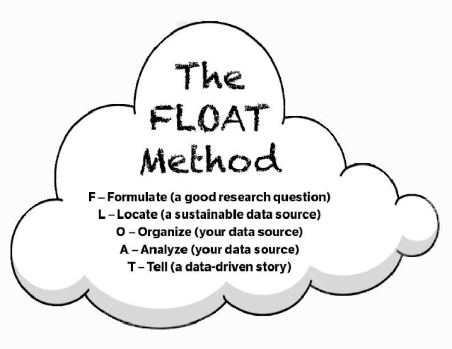
My colleague Peace Ossom-Williamson and I conceived of the FLOAT Method to organize the interrelated but disparate steps involved in creating a data story. FLOAT stands for the following:
I’ve taught a range of classes at the intersections of Black Studies and Digital Humanities (DH), over the past five years, where I guide students’ engagements with Tableau Public to transform datasets into interactive visualizations. Even though the content may vary from class-to-class, the FLOAT Method provides a useful framework for them to organize and analyze data.
The FLOAT method provides a common framework for students looking to transform quantitative and qualitative findings into visual aids. From conceiving of a research question to finally transforming data into a visualization, this five-step process involves cycling through the activities, all of which can take drastically different amounts of time, effort, and focus.
This process emphasizes the importance of developing useful research questions. A good research question establishes the boundaries of a given project and therefore helps to guide the research process by dictating what type of data and analysis a person will perform in a given project.
We published an Open Educational Resource (OER) last Fall, The Data Notebook. In this publication, we discuss the FLOAT Method in detail. Because all DH projects are drastically different, we hope this process will help bring some uniformity to students outlining a given project and even for professors looking for a useful way to evaluate data visualizations.
No comments:
Post a Comment