
My experiences teaching data storytelling give me an opportunity to think about how I translate texts into visual aids or summaries. In a 2021 Graduate seminar called “The New Jim Crow,” I worked with students to explore how anti-Black racist ideas, over the course of American history, contributes to the enforcement of traditional, as well as new modes of discrimination and oppression. We used data analytic methodologies to analyze quantitative and qualitative datasets related to recent voter suppression strategies.
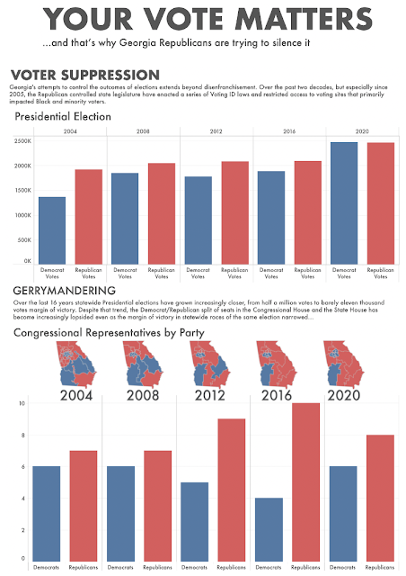
One student, Bailey Canon, produced a Tableau Public visualization that illustrated the extent to which voter suppression affects state and national elections in Georgia. Her project is inspired by Carol Anderson’s One Person, No Vote. In the visualization, she echoes Anderson’s sentiments regarding the development of voter ID laws, racial and partisan gerrymandering, and voter registration rolls purges by the Republican party disproportionately suppresses the votes of traditionally Democrat black and minority voters in the state of Georgia.
Bailey set out to answer the question: How has a combination of factors related to Voter ID laws, felony disenfranchisement, and gerrymandering impacted close state and national elections in Georgia over the past 16 years? By narrowing her focus to Georgia, she could identify specific data sources and pinpoint outlier districts.
In the book Storytelling with Data, Cole Nussbaumer Knaflic brings attention to two types of analyses that relate to the visualization process: exploratory and explanatory analysis. Exploratory analysis is what you do to understand the data and figure out what might be noteworthy or interesting to highlight. Explanatory analysis is when you settle on a specific finding you want to explain or a specific story you want to tell.
Knaflic likens the data storytelling process to opening 100 oysters where you might only find two pearls. She goes on to note people too often overwhelm audiences by trying to show 100 oysters, that is, too much. For her, it’s simple: “Concentrate on the pearls, the information your audience needs to know.” Bailey’s visualization similarly focuses on a key pearl: voter suppression strategies across the US.
My advice to people working on data storytelling projects or even teaching these methodologies to students is to always define the broad parameters of research question(s). In the end, it makes the research project manageable and yields insight to a specific, well-defined problem.
No comments:
Post a Comment